
Quick Links
🔗 Quickly navigate to relevant content with a configurable list of links.
1. Overview
The Quick Links widget displays a set of internal and external links on a dashboard, so users can reach frequently used pages in one click.
Quick Links is configured through a visual builder. Links, icons, layout and styling can all be set without writing JSON, while Edit JSON remains available for advanced configuration.
The Quick Links widget allows you to:
- Add internal and external links, with external links named automatically after the page's own web title.
- Rename, reorder and delete links, with the option to undo a deletion.
- Choose a favicon, custom icon or uploaded image for each link.
- Display links in a grid or list layout.
- Choose whether links open in a new tab.
2. Adding a Quick Links Widget
Watch the guided demo below to learn how to export data.
You can also follow the same steps using the written guide below.
- Open the required dashboard tab in edit mode.
- Click + Add Widget.
- In the Add Widget window, select New Widget, then select Quick Links.
- Under Heading, enter a title for the widget. The default is Quick Links.
- Optionally, click + Add tooltip and enter the tooltip text.
- In the Data tab, enter an internal link or an external URL (for example,
https://figma.com) in the link field. - Click Add Link. The link is added to the top of the list and appears in the widget preview.
- Repeat steps 6 and 7 for each link you want to add.
- Click Save.
The widget preview on the left updates as you configure it. Clicking Cancel with unsaved changes opens a Discard changes confirmation.
2.1. Automatic Link Titles
External links are named automatically after the page's own web title. For example, adding https://figma.com creates a link titled Figma.
Internal links are recognised automatically and are named after their path (for example, /app/reports). Use Rename to give them a friendlier name (see section 3.1).
2.2. Title and URL Display
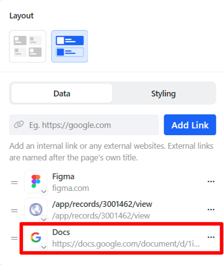
Each link shows its title with the URL underneath. Both the title and the URL are kept to a single line. Longer values are truncated with an ellipsis (...).
3. Managing Links
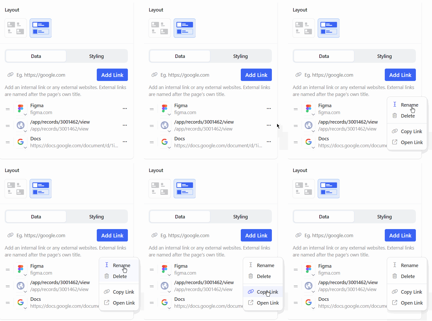
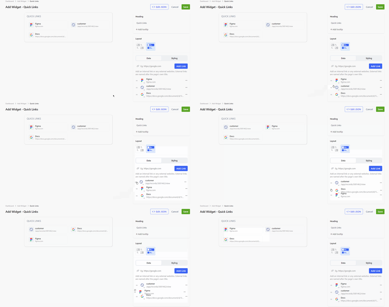
Each link in the list has a drag handle (=) on the left, an icon selector, and a three dot menu on the right.
| Menu Option | Description |
|---|---|
| Rename | Changes the display name of the link. |
| Delete | Removes the link from the widget, with the option to undo. |
| Copy Link | Copies the link URL. |
| Open Link | Opens the link. |
3.1. Renaming a Link
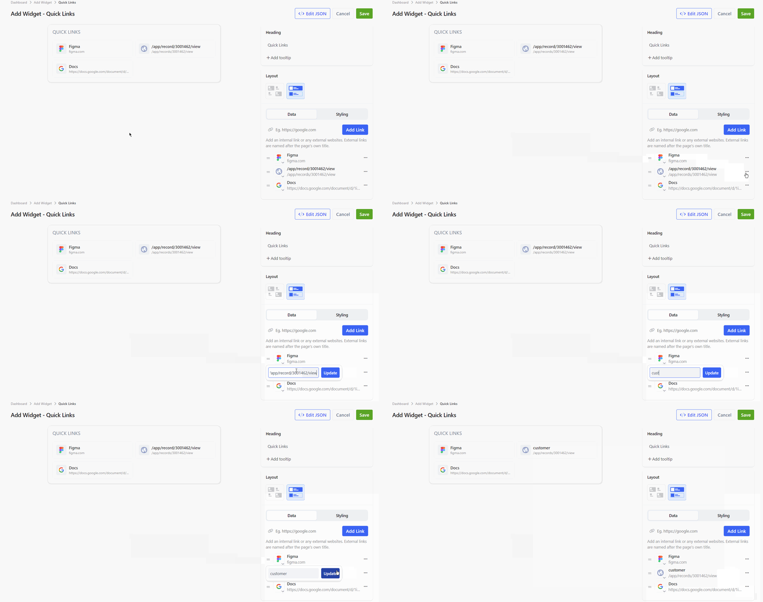
- Click the three dot menu next to the link.
- Select Rename.
- Enter the new name.
- Click Update.
3.2. Deleting a Link
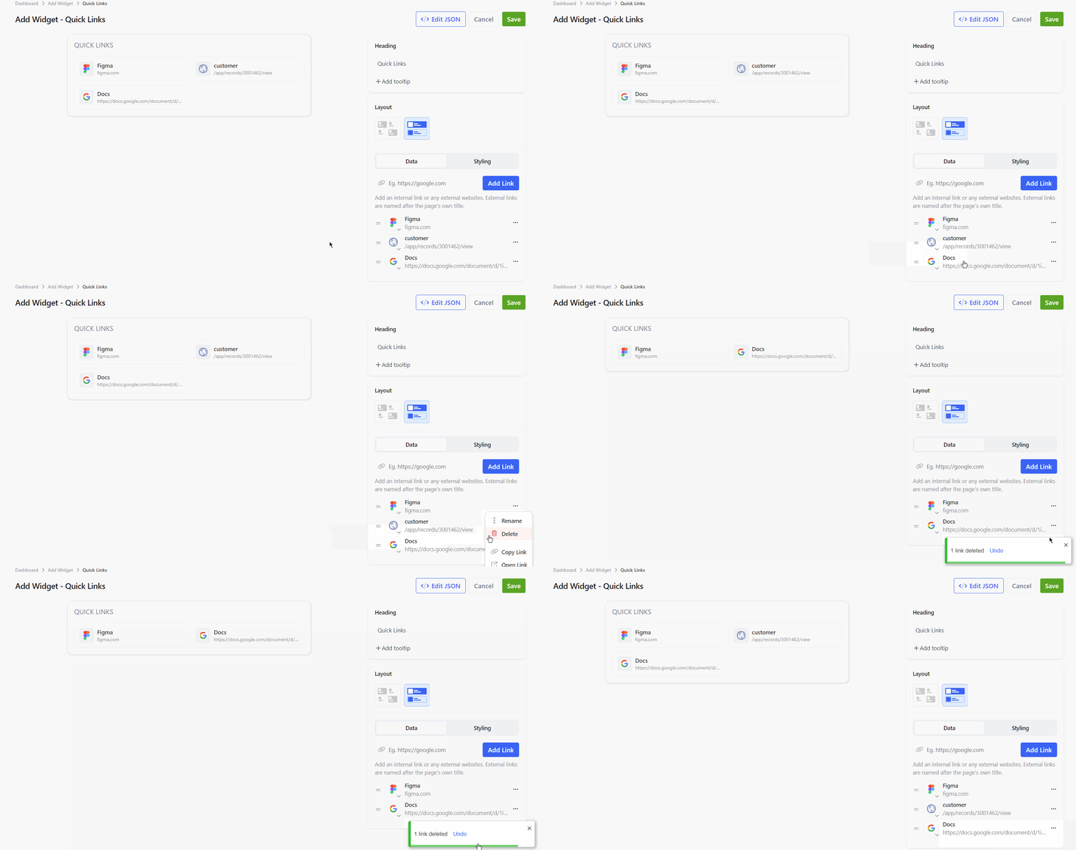
- Click the three dot menu next to the link.
- Select Delete.
The link is removed and a toast appears with the message 1 link deleted and an Undo option. Click Undo while the toast is visible to restore the link to its original position.
3.3. Reordering Links
Drag a link by its handle (=) and drop it in the required position. The widget preview follows the new order.
3.4. Changing the Link Icon
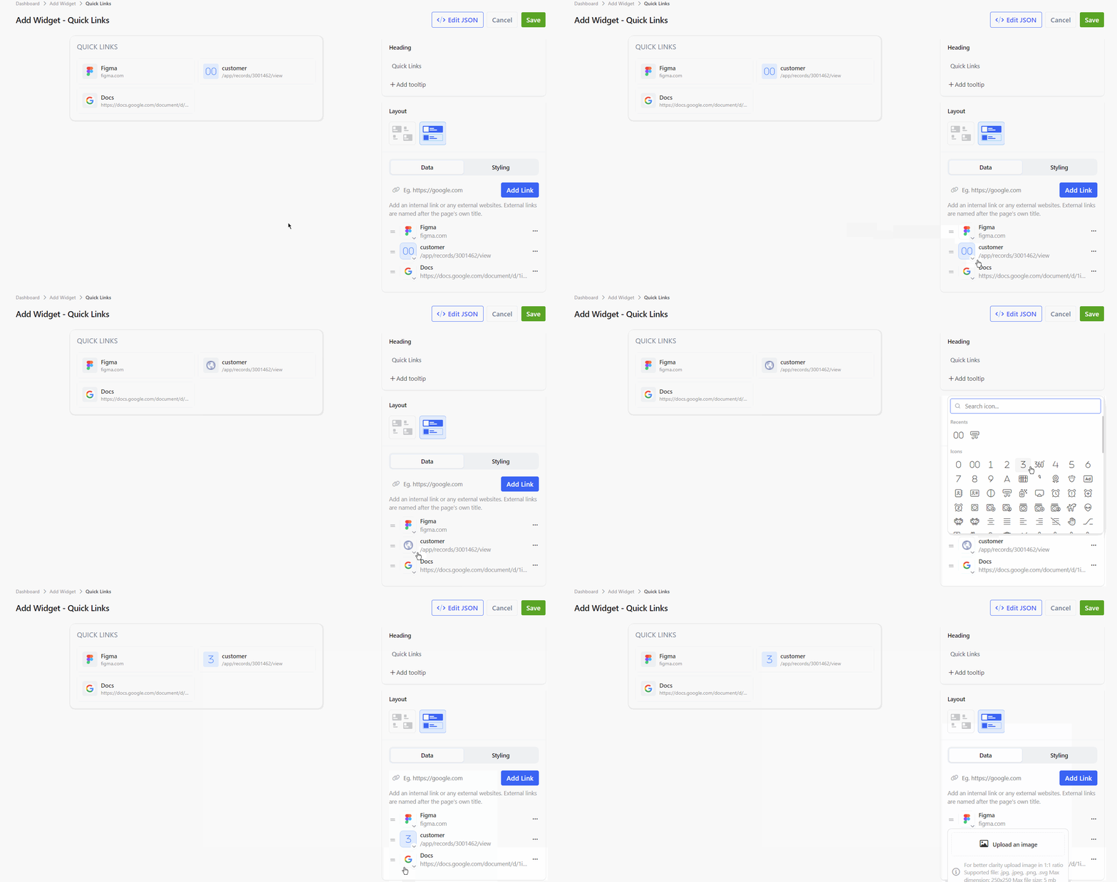
Click the icon next to a link to choose how it is represented:
- Favicon: Uses the website's own icon. This is the default for new links.
- Custom Icon: Opens an icon search. Select an icon, then pick an icon colour from the colour options or enter a hex value.
- Upload Image: Uses an uploaded image as the icon.
4. Layout and Styling
4.1. Layout
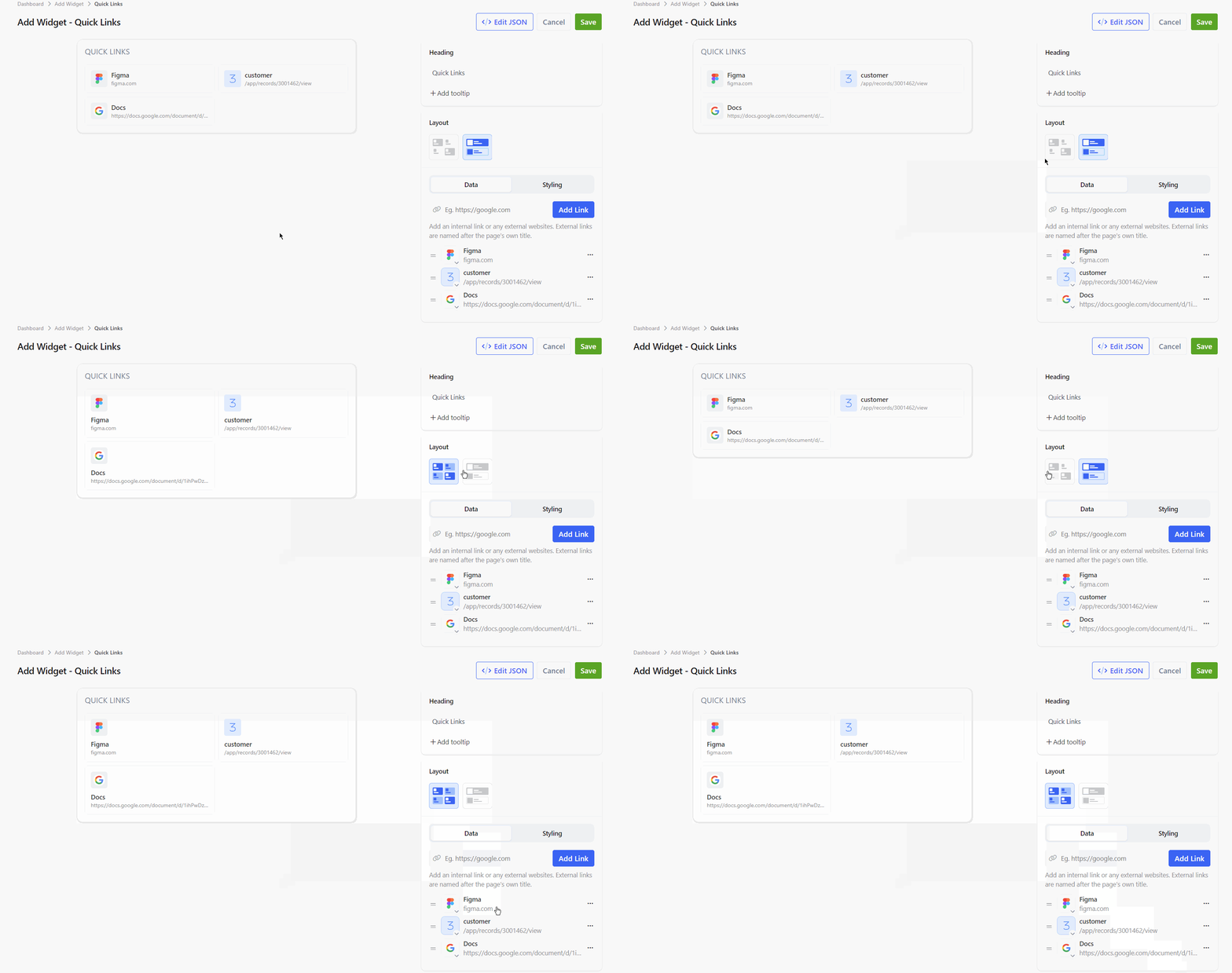
The Layout section offers two display options:
- Grid: Links are shown as tiles, with the icon above the title and URL.
- List: Links are shown as rows, with the icon beside the title and URL. This is the default layout for a new widget.
4.2. Styling
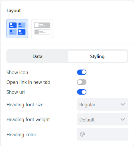
Select the Styling tab to configure how links and the heading are displayed.
| Option | Type | Default | Description |
|---|---|---|---|
| Show icon | Toggle | On | Shows the icon next to each link. |
| Open link in new tab | Toggle | Off | Opens links in a new browser tab when turned on. |
| Show url | Toggle | On | Shows the URL under each link title. |
| Heading font size | Selection | Regular | Sets the heading size: Regular, Large or Extra Large. |
| Heading font weight | Selection | Default | Sets the heading weight: Light, Default or Bold. |
| Heading color | Colour picker | None | Sets the colour of the widget heading. |
5. JSON Configuration
Click Edit JSON in the builder to view or edit the widget configuration directly. Settings made in the builder are written to the config object.
{
    "config": {
        "title": "Quick Links",
        "titleStyle": {
            "fontSize": "large",
            "fontWeight": "bold",
            "color": "#2b8bfe"
        },
        "type": "icon",
        "openInNewTab": true,
        "hideUrl": true,
        "links": [
            {
                "name": "GitHub",
                "value": "https://github.com",
                "useFavicon": false,
                "icon": "fal fa-home",
                "iconColor": "#2b8bfe"
            },
            {
                "name": "Reports",
                "value": "/app/reports",
                "type": "internal",
                "useFavicon": true
            }
        ]
    }
}
5.1. Widget Properties
| Property | Type | Description |
|---|---|---|
title | Text | The widget heading. |
titleStyle | Object | The heading styles set on the Styling tab. Not included when all heading options are left at their defaults. |
titleStyle.fontSize | Text | Set by Heading font size. Values: large or extralarge. |
titleStyle.fontWeight | Text | Set by Heading font weight. Values: light or bold. |
titleStyle.color | Text | Set by Heading color. A hex colour code, for example #2b8bfe. |
type | Text | Set to icon when the Grid layout is selected. |
openInNewTab | Boolean | true when Open link in new tab is turned on. |
hideIcon | Boolean | true when Show icon is turned off. |
hideUrl | Boolean | true when Show url is turned off. |
links | Array | The list of links in display order. |
5.2. Link Properties
| Property | Type | Description |
|---|---|---|
name | Text | The display name of the link. |
value | Text | The internal path or external URL. |
type | Text | Set to internal for links inside Clevero. |
useFavicon | Boolean | true when the Favicon icon option is used. |
icon | Text | The selected custom icon, for example fal fa-home. |
iconColor | Text | The hex colour of the custom icon. |
6. Notes
- New links are added to the top of the list. Drag them to reorder.
- Clicking Add Link adds the link. Pressing Enter in the link field does not.
- Changes are only applied to the dashboard after clicking Save.
📌 Need Help?
If you require assistance or encounter any issues, please don't hesitate to contact us for further support.
Updated 8 days ago