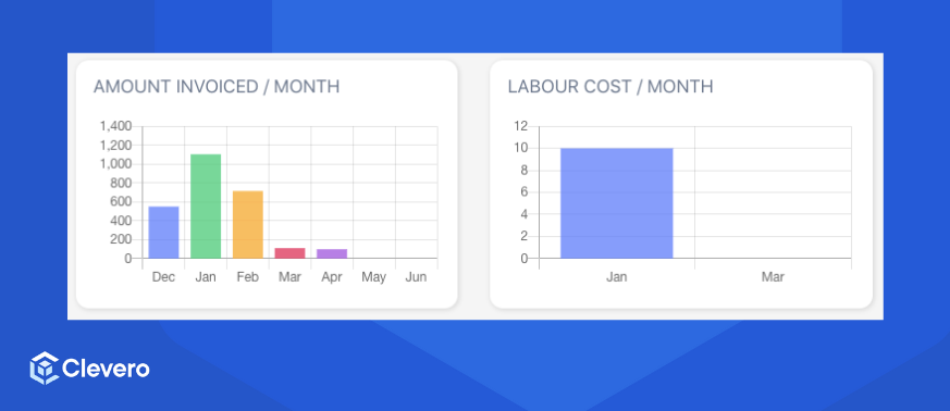
Bar Graph
📊 Visualize data using bars for easy comparison and insights.
A Bar Graph represents data using rectangular bars to compare values across categories. It helps users quickly identify trends, differences, and patterns in their data.
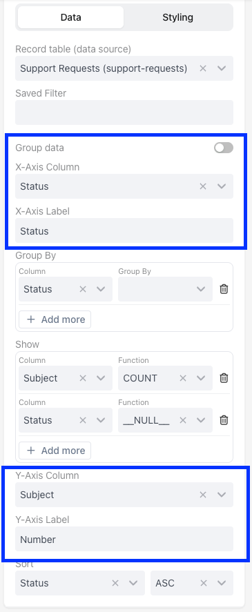
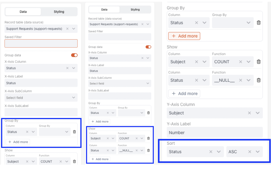
A Bar Graph widget consists of two main sections:
config: Controls the appearance and layout of the graph.aggregation: Controls how the data is grouped, calculated, and sorted before display.
Complete JSON Example
{
  "config": {
    "type": "bar-graph",
    "settings": {
      "title": "Support Cases by Status",
      "x-axis": {
        "accessor": "status",
        "label": "Status",
        "xMainAccessor": "status",
        "xSubAccessor": "team"
      },
      "y-axis": {
        "accessor": "case",
        "label": "Number of Cases",
        "prefix": "$",
        "maxDecimals": 1
      },
      "isGroupedData": false,
      "hideGrid": false,
      "hideLabels": false,
      "fill": "#8884d8"
    }
  },
  "aggregation": {
    "groupBy": [
      {
        "column": "status",
        "accessor": "status"
      }
    ],
    "functions": [
      {
        "column": "title",
        "fn": "COUNT",
        "alias": "case"
      },
      {
        "column": "status",
        "fn": "__NULL__",
        "alias": "status"
      }
    ],
    "sort": {
      "sortBy": "status",
      "order": "asc"
    }
  },
  "base-record": "72911",
  "saved-search": "265745"
}
1. Widget Configuration (config)
config)This section configures the appearance and labelling of the Bar Graph.
type: Specifies that the widget is a Bar Graph.settings: Defines various settings for the Bar Graph.title: Sets the title of the graph.x-axis: Configures the X-axis (horizontal axis) of the graph.accessor: Specifies where the data for the X-axis comes from.label: Provides a label for the X-axis, which is "Month" in this case.y-axis: Configures the Y-axis (vertical axis) of the graph.accessor: Specifies where the data for the Y-axis comes from.label: Provides a label for the Y-axis.fill: Sets the fill colour of the bars.
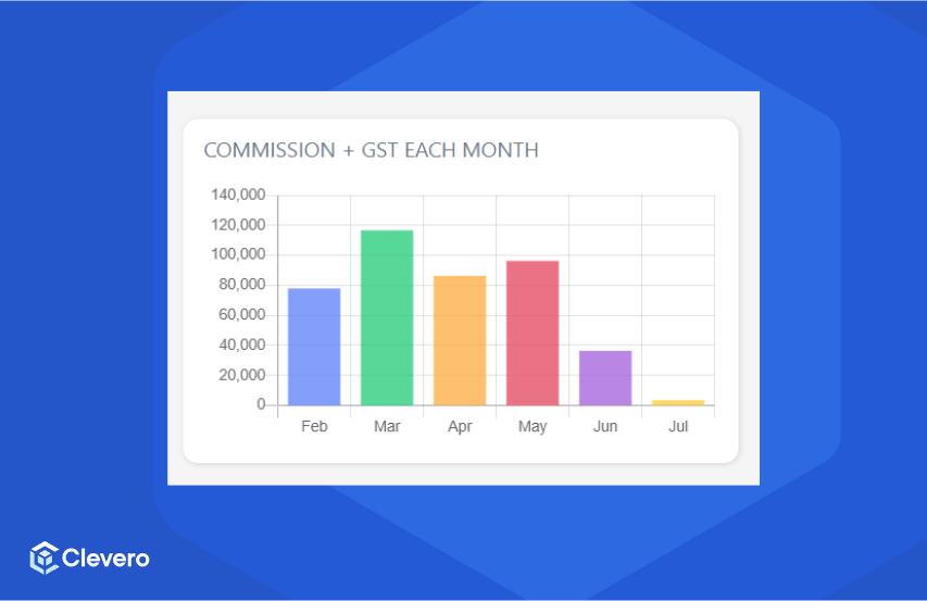
JSON Example
{
    "type": "bar-graph",
    "settings": {
        "title": "Commission + GST Each Month",
        "x-axis": {
            "accessor": "month",
            "label": "Month"
        },
        "y-axis": {
            "accessor": "commissiongst",
            "label": "Commission + GST"
        },
        "fill": "#8884d8"
    }
}
2. Widget Aggregation (aggregation)
aggregation)This part defines how data is aggregated for the Bar Graph. It specifies the columns to group by, functions to apply, and sorting order.
groupBy: Indicates that the specified column should group data within a specified date format.functions: Specifies functions to be applied to columns. For example: Calculate the sum of values in the column.
Function (fn) | What it does |
|---|---|
SUM | Adds all the numbers together |
COUNT | Counts how many entries are there |
AVG | Calculates the middle value |
MIN | Finds the smallest number |
MAX | Finds the largest number |
DATE_FORMAT | Groups messy dates into clean "Months" or "Weeks." |
__NULL__ | Just grabs the name/text without doing any math. |
sort: Specifies sorting based on the column in ascending order.
JSON Example
{
    "groupBy": [
        {
            "column": "idr-submission-date",
            "fn": "DATE_FORMAT",
            "config": {
                "type": "M"
            }
        }
    ],
    "functions": [
        {
            "column": "commission-gst",
            "fn": "SUM",
            "alias": "commissiongst"
        },
        {
            "column": "idr-submission-date",
            "fn": "DATE_FORMAT",
            "config": {
                "type": "M"
            },
            "alias": "month"
        }
    ],
    "sort": {
        "sortBy": "idr-submission-date",
        "order": "asc"
    }
}
The example configuration above is shown as:
📌 Need Help?