
Card Views
A visual layout for browsing records as cards instead of a table.
1. Overview
Card View is a record view type that displays records as visual cards rather than table rows. Each card can show a title, image, tags, and other key details, making it easier to browse and recognise records by sight, for example, by photo, colour-coded status, or tag, instead of searching by name or number.
Card View is created the same way as other record views (Table View, Calendar View, Kanban View) and appears as an additional view alongside them. Creating a Card View does not change any existing views.
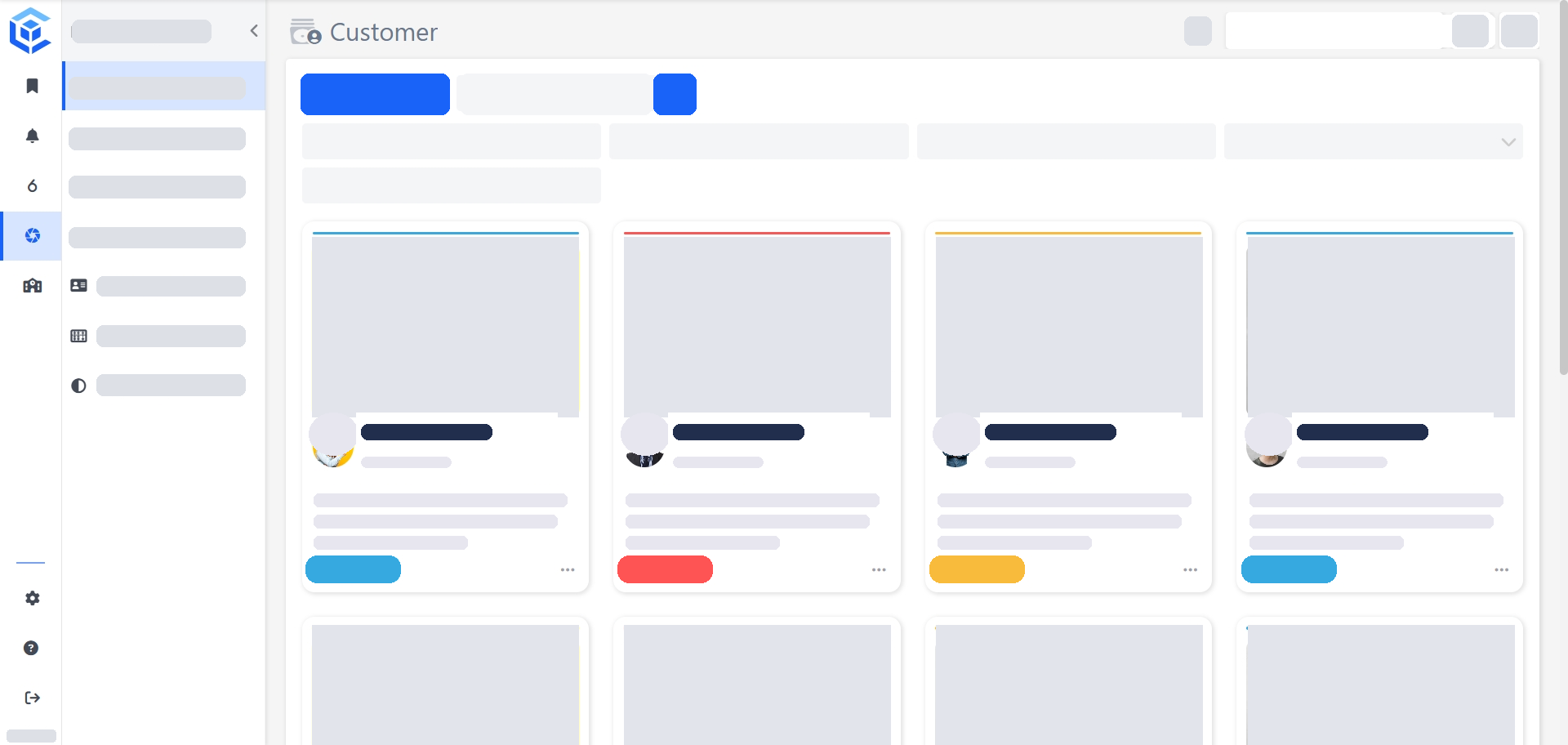
2. Benefits
Card View allows users to:
- Browse and recognise records visually.
- Spot patterns across a full list at a glance, such as overdue jobs or low-stock items.
- Keep using the existing search bar, sorting, filters, and report widgets alongside the new view.
3. Creating a Card View
Watch the guided demo below to create and apply a Card View.
You can also follow the same steps using the written guide below.
- Open the record list you want to add a Card View to (for example, Customer).
- Click Views in the top right of the record list.
- In Manage Record Views, click New View, then select Card View as the view type.
- Enter a name in Record View Name. Check Hide Search Field if you don't want the search bar to show on this view.
- Under Card Data, select the Title field and a Card Design layout. Both are required.
- Optionally map any of Pre-Title, Body Text, Primary Image, Secondary Image, Tags, or Color. The preview panel updates as you map each field.
- Optionally set Default Sorting by choosing a field and a sort direction.
- Optionally add fields to Quick Filters.
- Optionally add report widgets from Advanced Settings.
- Click Save.
4. Configuration
| Property | Type | Requirement | Description |
|---|---|---|---|
| Record View Name | Text | Mandatory | Name of the Card View. |
| Hide Search Field | Checkbox | Optional | Hides the search bar for this view when enabled. |
| Title | Field selector | Mandatory | Field displayed as the card's title. |
| Card Design | Selection | Mandatory | Grid layout used for the card. |
| Pre-Title | Field selector | Optional | Field displayed above the title. |
| Body Text | Field selector | Optional | Field displayed as the card's body content. |
| Primary Image | Field selector | Optional | Image field shown as the card's main image. |
| Secondary Image | Field selector | Optional | Image field shown as a secondary image on the card. |
| Tags | Field selector | Optional | Field displayed as tags on the card. |
| Color | Field selector | Optional | Field used for the card's colour coding. |
| Default Sorting | Field selector + direction | Optional | Field and direction (for example, Ascending) records are sorted by. Can be set from record fields or System Fields. |
| Quick Filters | Field selector(s) | Optional | Fields added to the quick filter bar. Can include record fields or System Fields. |
5. Card Design
Card Design sets the layout used for each card. Ten grid layouts are available:
- Grid 1–5 (with image)
- Grid 1–5 without image
Selecting a design updates the live preview panel to reflect the chosen layout.
6. Notes
- Creating a Card View does not affect any existing views on the record list.
- Default Sorting and Quick Filters can use either the record's own fields or System Fields (for example, Auto ID, Created At, Created By).
📌 Need Help?
If you require assistance or encounter any issues, please don't hesitate to contact us for further support.
Updated about 2 hours ago