Count Links
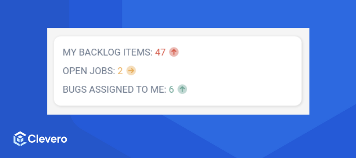
1️⃣ Display counts with clickable links.
The Count Links widget is used to display links to filtered results of entries, and also to display the number (count) of results. This helps our users see a quick summary of the entries that need their attention.
1. Configuration Example
Below is an example of widget configuration:
{
"type": "count-links",
"config": {
"title": "My todos",
"titleStyle": {
"fontSize": "extralarge",
"fontWeight": "bold",
"color": "red"
},
"content": [
{
"record": "backlog-items",
"label": "My backlog items",
"filter": [
[
{
"subject": 9661,
"type": "array",
"operator": "any_of",
"value": [
"223683"
]
}
]
],
"numberFormat": "default",
"primaryFilter": [
{
"subject": "date-opened",
"requestType": "i",
"type": "date",
"operator": "on_or_after",
"value": {
"relative": true,
"type": "minus_years",
"value": 1
}
}
],
"secondaryFilter": [
{
"subject": "date-opened",
"requestType": "i",
"type": "date",
"operator": "within",
"value": {
"from": {
"relative": true,
"type": "minus_years",
"value": 2
},
"to": {
"relative": true,
"type": "minus_years",
"value": 1
}
}
}
],
"secondaryValueDisplay": "function({primaryValue, secondaryValue}){return {value:`Up by ${primaryValue - secondaryValue} vs last year`, size: 'sm'}}",
"searchParams": {
"layoutId": 557923,
"pageSize": 5
},
"defaultStyle": {
"icon": "fa-duotone fa-circle",
"color": "default",
"labelSize": "extralarge",
"labelWeight": "light",
"labelColor": "green"
},
"styleWhenGreaterThanOrEqualTo": {
"10": {
"icon": "fa-duotone fa-circle-arrow-down",
"color": "green",
"labelSize": "extralarge",
"labelWeight": "light",
"labelColor": "green"
},
"20": {
"icon": "fa-duotone fa-circle-arrow-right",
"color": "yellow",
"labelSize": "large",
"labelWeight": "default",
"labelColor": "red"
},
"30": {
"icon": "fa-duotone fa-circle-arrow-up",
"color": "#ff00ff",
"labelSize": "regular",
"labelWeight": "bold",
"labelColor": "yellow"
}
}
},
{
"record": "bug-report",
"label": "Bugs assigned to me",
"filter": [
{
"subject": "assigned-to",
"type": "ME"
}
],
"numberFormat": "default",
"secondaryValueDisplay": "function(){return {value:'1000', icon: 'fa-duotone fa-bullseye-arrow', color: 'red'}}",
"defaultStyle": {
"icon": "fa-duotone fa-circle",
"color": "default",
"labelSize": "extralarge",
"labelWeight": "light",
"labelColor": "default"
},
"styleWhenGreaterThanOrEqualTo": {
"0": {
"icon": "fa-duotone fa-circle-arrow-down",
"color": "red",
"labelSize": "extralarge",
"labelWeight": "light",
"labelColor": "green"
},
"2": {
"icon": "fa-duotone fa-circle-arrow-right",
"color": "yellow",
"labelSize": "large",
"labelWeight": "default",
"labelColor": "red"
},
"5": {
"icon": "fa-duotone fa-circle-arrow-up",
"color": "yellow",
"labelSize": "regular",
"labelWeight": "bold",
"labelColor": "yellow"
}
}
}
]
}
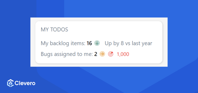
}The example configuration above is shown below:
2. Breakdown of Components
Let's break down each component of the configuration:
2.1. Options
Configuration | DetailsTitle |
|---|---|
| Used as the widget's title. |
| Styles the widget title with:
|
| Each item in the content array represents a link to filtered entries with specific settings. |
| Search parameters when the user clicks on the widget to redirect a view page. |
| The default style for the widget. |
| Change the icon colour based on the count. |
2.2. Style
Use style objects to adjust the appearance of each line in the widget:
{
    "color": "green",
    "icon": "fa-duotone fa-circle",
    "textColor": "green",
    "textSize": "large"
    "labelSize": "extralarge",
    "labelWeight": "light",
    "labelColor": "green"

}
Style | Details |
|---|---|
| The icon must be a valid "font awesome" icon. |
| It can be a word or any valid hex value, e.g. #ff00ff. Word options for colours:
|
| It can be a word or any numerical format, e.g. 1rem, 10px etc. Word options for font size:
|
| It can be a word or any valid number, e.g. 100, 500, or 700. Word options for font-weight:
|
Info:Setting
textSizechanges the font size of the count number and the icon.
3. Styling based on the count
The styleWhenGreaterThanOrEqualTo key is used for altering the icon's appearance based on the count value.
Use Case #1: Changing Icon Color
We adjust the icon colour based on the count value in the following example. If the number of tasks scheduled for today exceeds 6, we highlight it with a red icon. If not, we opt to hide the icon altogether.
{
    "styleWhenGreaterThanOrEqualTo": {
        "6": {
            "icon": "fa-duotone fa-circle-arrow-down",
            "color": "red",
            "textColor": "red",
            "labelSize": "large",
            "labelWeight": "light",
            "labelColor": "red"
        }
    }
}
Use Case #2: Multi-Level Styling
We can further enhance the display by using multiple levels of styling. For example:
- If tasks for the day are less than 4, a green icon is shown.
- If the count falls between 8 and 14, a yellow icon is displayed.
- If the count surpasses 15, a red icon is chosen.
{
    "styleWhenGreaterThanOrEqualTo": {
        "0": {
            "icon": "fa-duotone fa-circle-arrow-up",
            "color": "green",
            "labelSize": "regular",
            "labelWeight": "light",
            "labelColor": "green"
        },
        "4": {
            "icon": "fa-duotone fa-circle",
            "color": "default",
            "labelSize": "large",
            "labelWeight": "default",
            "labelColor": "default"
        },
        "8": {
            "icon": "fa-duotone fa-circle-arrow-right",
            "color": "yellow",
            "labelSize": "large",
            "labelWeight": "bold",
            "labelColor": "yellow"
        },
        "15": {
            "icon": "fa-duotone fa-circle-arrow-down",
            "color": "red",
            "labelSize": "extralarge",
            "labelWeight": "bold",
            "labelColor": "red"
        }
    }
}
📌 Need Help?