Navigation Layout
✅ Structured design for easy interface navigation.
The Navigation Layout is a component within a system's user interface located in the sidebar. It functions as a control centre for accessing Menus, Shortcuts, and essential features.
1. Creating a Navigation Layout
Watch the guided demo below to create a new navigation layout.
You can also follow the same steps using the written guide below.
- Go to "Settings" > "System Settings".
- Select the "Navigations" menu.
- Click on "+ Create Navigation Layout" to create a new layout.
- Configure the layout settings:
- Name: Enter a name for the Navigation Layout.
- Instance: Automatically set based on the system you're working in.
- Item Size: Choose the display size: Regular, Large, or Extra Large. Regular is recommended.
- Roles Assignments: Select the user roles that should use this layout.
- Click on the "+Add Item" button. The Navigation Layout supports several item types.
Category
A category groups related items together and supports multi-level navigation. The available configurations are:
- Label: Sets the display name of the category.
- Icon: Selects an icon to visually represent the category.
- Subtype: Optionally defines a subtype for more specific organization.
- Expanded: Determines whether the category is expanded by default when the page loads.
- Open category on click: If enabled, clicking the category opens its link even when another category is expanded. If disabled, clicking the category only expands or collapses it.
Record Link
A Record Link provides direct access to a specific record, view, or page within the system. The available configurations are:
- Label: Sets the display name of the link.
- Icon: Selects an icon to visually represent the link.
- Record: Chooses the specific record or module the link points to.
- Exact Match: Determines whether the link must match the selected record exactly.
- Variant: Specifies how the record is opened, such as layout, scheduler, entry, form, or other available variants.
- Data: Adds additional data, including form values and prefilled fields. This includes:
- Key: Defines the field or parameter name.
- From: Specifies where the value is sourced from.
- Prefilled Fields: Automatically fills selected fields when the record or form is opened.
- Search Params: Adds search parameters to help narrow down or retrieve specific records.
- Sort By: Sets the field used to sort results.
- Sort Order: Defines the sorting direction, such as ascending or descending.
- Saved Search ID: Applies a previously saved search configuration.
- Page Size: Controls how many records are displayed per page.
- Portal Key: Specifies the portal or context key used for the record link.
- Filter (Where): Applies conditions to filter displayed records. Learn more about filters here.
- Queries: Configures additional query conditions and options, including:
- Where Condition: Defines the filtering logic for records.
- Can Toggle: Allows users to enable or disable the query filter.
- Active: Determines whether the query is enabled by default.
Record Button
A Record Button allows users to trigger actions for specific records directly from the interface. The available configurations are:
- Label: Sets the display name of the button.
- Icon: Selects an icon to visually represent the button.
- Record: Chooses the target record associated with the button action.
- Button Type: Defines the action performed by the button, such as opening an add modal or launching a form.
- Params: Adds additional parameters required for the action, including:
- Hotkey: Assigns a keyboard shortcut for the button action.
- Portal Key: Specifies the portal or context key used for the action.
- Form: Defines the form associated with the button action.
- Prefilled Fields: Automatically fills selected form fields when the action is triggered.
- Add Fullscreen: If enabled, opens the form or modal in fullscreen mode.
Link
A Link directs users to an internal page or an external website. The available configurations are:
- Label: Sets the display name of the link.
- Icon: Selects an icon to visually represent the link.
- URL: Specifies the destination URL or web address.
- External: If enabled, indicates that the link points to a website or page outside the system.
- New Tab: If enabled, opens the link in a new browser tab.
- Match Within: If enabled, keeps the link active when users navigate within matching related paths or pages.
Others
The following additional item types are available for navigation and quick access features:
| Type | Details |
|---|---|
| Divider | Adds a visual separator between navigation items for better organisation. |
| Notifications | Displays real-time updates, alerts, and system notifications. |
| Bookmarks | Allows users to save and quickly access frequently used pages or records. |
| Compound Quick Access | Creates personalised shortcuts that combine multiple item types in one place. |
| Quick Add | Allows users to quickly create new records without leaving the current page. |
| Timer | Provides direct access to timers and time-tracking functions. |
| Reporting | Provides quick access to reporting dashboards and analytics pages. |
| Unified Search | Opens the system-wide search feature for finding records, pages, or data quickly. |
- After configuring the layout, click Save to store the configuration.
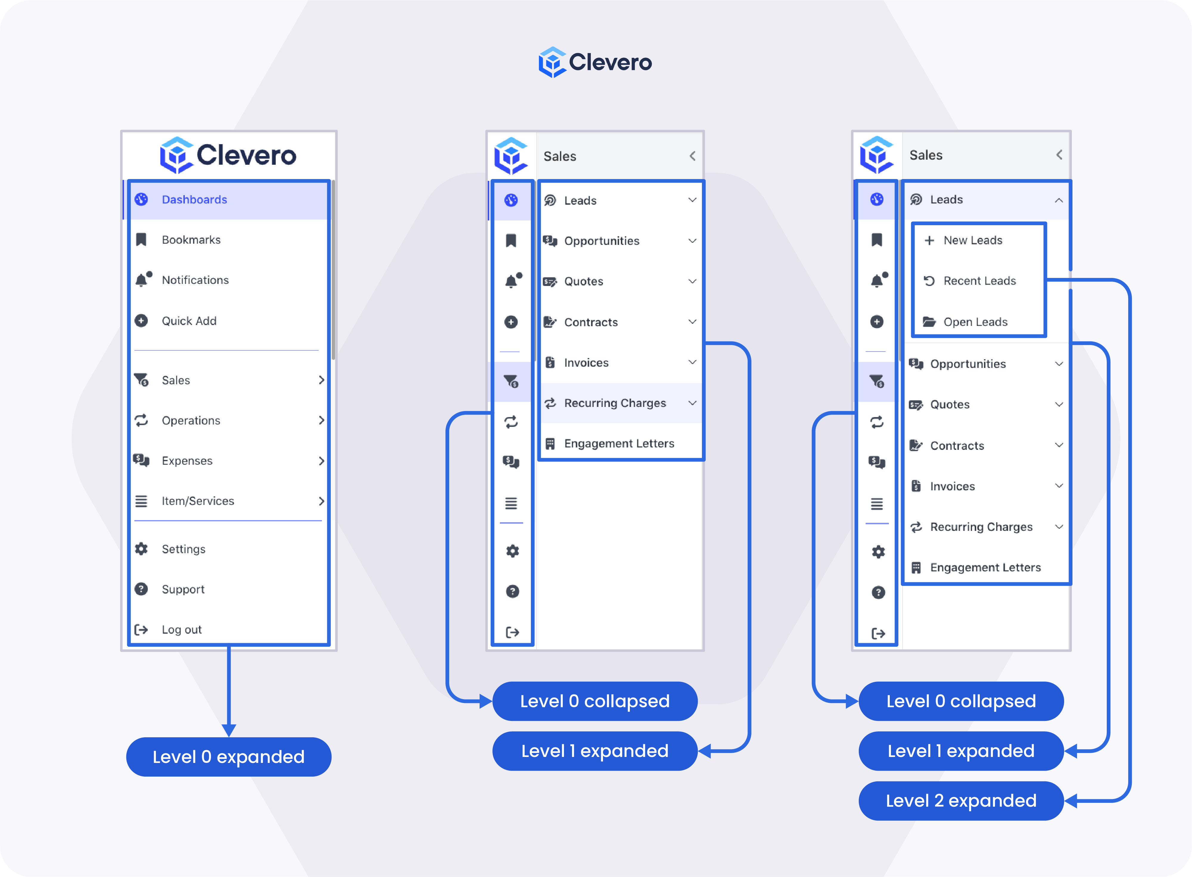
2. Navigation Levels
Navigation Layouts use a hierarchical structure called levels.
2.1. Levels Overview
| Level | Description |
|---|---|
| Level 0 | Displays primary navigation categories. These items always appear on the left side of the navigation bar and must include icons. |
| Level 1 | Displays sub-menu items when a Level 0 category is opened. Icons are optional. |
| Level 2 | Displays nested items when both Level 0 and Level 1 categories are opened. Icons are optional. |
Refer to the illustrations below for examples of navigation levels:
2.2. Creating a Multi-Level Layout
To create nested navigation levels, use the following options in the Navigation Builder:
| Option | Description |
|---|---|
| Add Collapsible | Creates a collapsible category or section that can contain additional navigation items. This is commonly used to organise related items under the same expandable menu. |
| Add Menu Items | Adds child items or sub-menu items inside a collapsible category, allowing you to build multi-level navigation structures. |
| Add Divider | Inserts a visual separator between navigation items to improve organisation and readability within the menu. |
The example below demonstrates a multi-level Navigation Layout:
| Section | Category (Level 0) | Category (Level 1) | Item Type | Example |
|---|---|---|---|---|
| 1 | Dashboard | Reporting | Sales Dashboard | |
| 2 | Support | Cases | Record Link | All Cases |
| Cases | Quick Add | Create Case | ||
| Knowledge Base | Link | Help Centre | ||
| 3 | Productivity | Tasks | Timer | Task Timer |
| Search | Unified Search | Global Search | ||
| 4 | General | Notifications | Notifications |
To create the layout above:
-
Add a Category item named Dashboard and assign an icon.
-
Under the Dashboard category, click Add Menu Items, then add a Reporting item for Sales Dashboard.
-
Add another Category item named Support and assign an icon.
-
Under the Support category, click Add Collapsible to create a collapsible section named Cases.
-
Inside the Cases section, click Add Menu Items, then add:
- A Record Link item for All Cases
- A Quick Add item for Create Case
-
Click Add Divider to insert a separator below the Cases items.
-
Under the Support category, click Add Collapsible again to create another section named Knowledge Base.
-
Inside the Knowledge Base section, click Add Menu Items, then add a Link item for Help Centre.
-
Add another Category item named Productivity and assign an icon.
-
Under the Productivity category, click Add Collapsible to create a section named Tasks, then add a Timer item for Task Timer.
-
Add another collapsible section named Search, then add a Unified Search item for Global Search.
-
Add a Notifications item under the General category.
-
Click Save to store the Navigation Layout configuration.
📌 Need Help?