Modals v. Full Screen
🆚 Comparison of Modals & Full Screen for Enhanced User Experience.
When designing user interfaces, using Modals or Full-Screen layouts can significantly impact the user experience. Let's explore the characteristics and considerations for each approach:
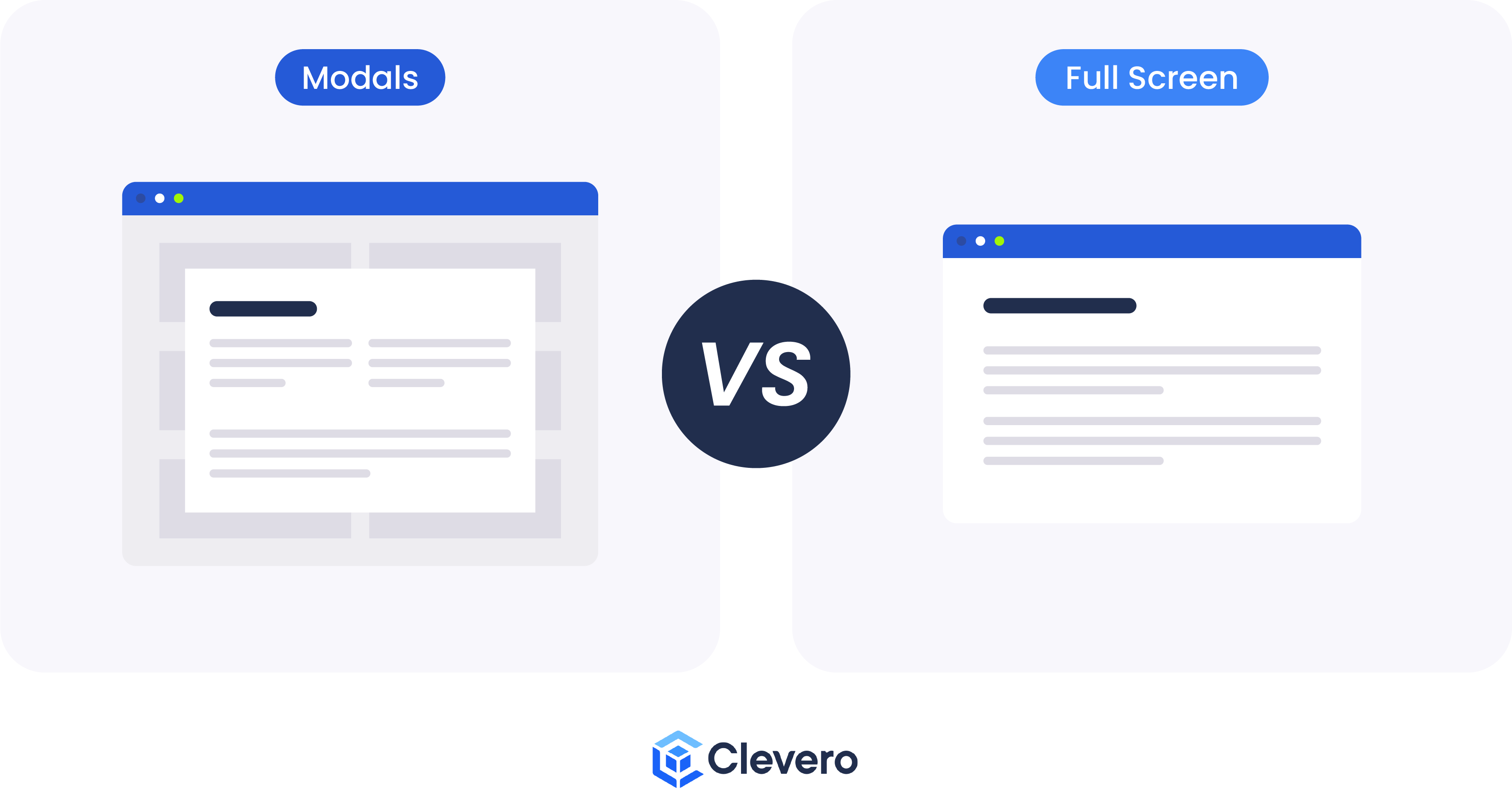
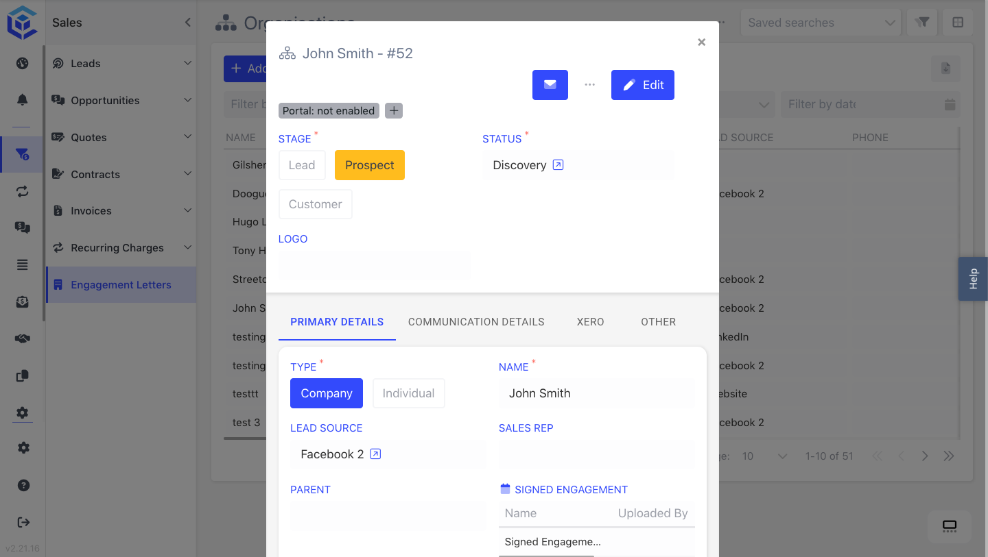
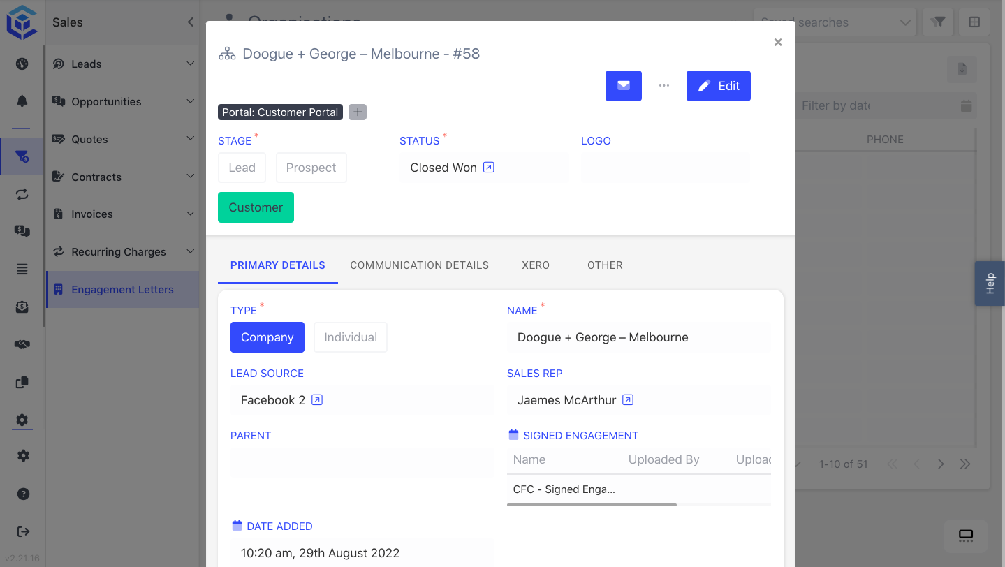
1. Modals
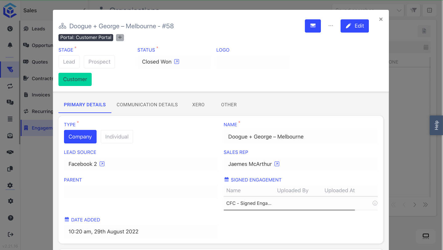
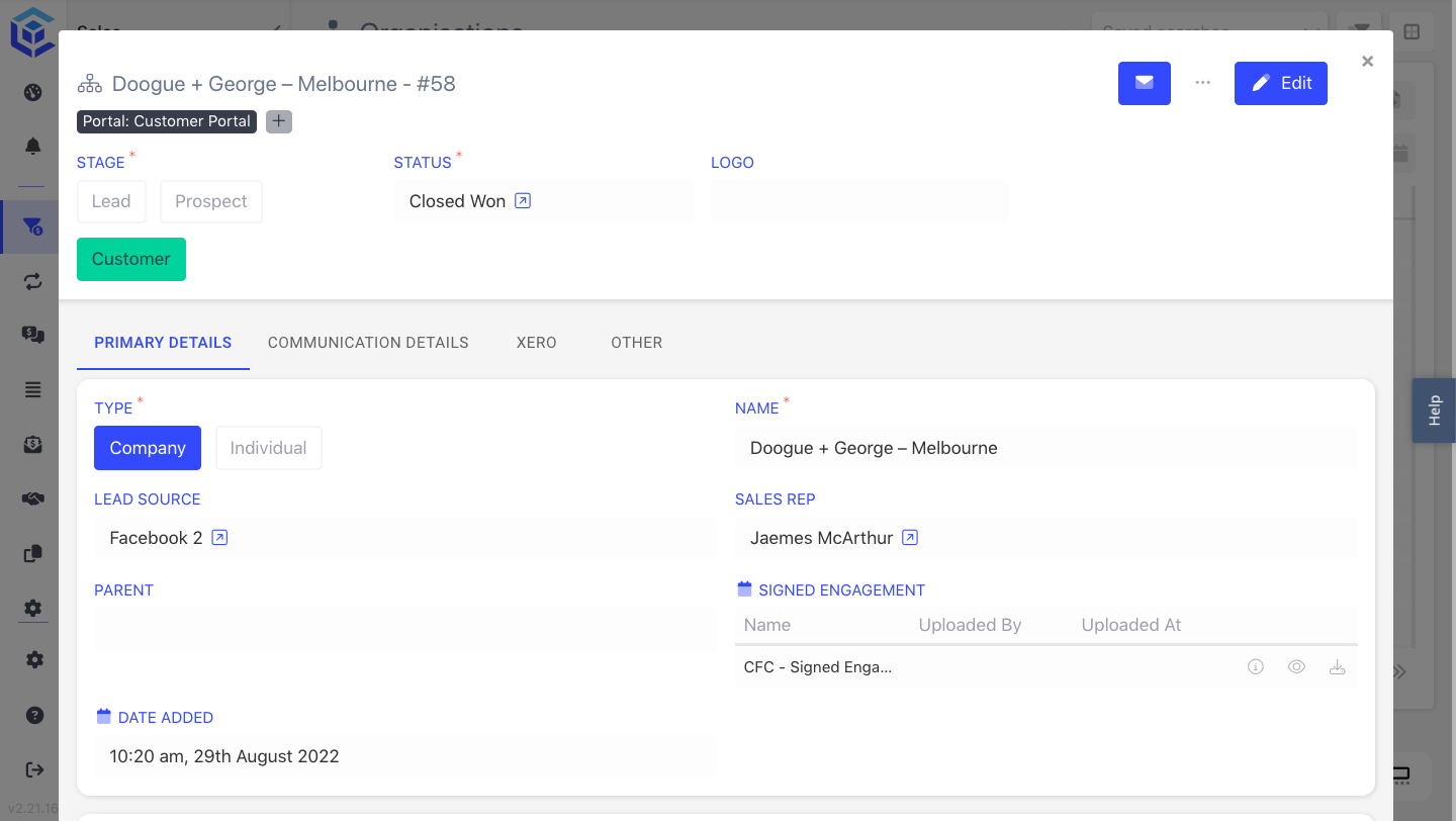
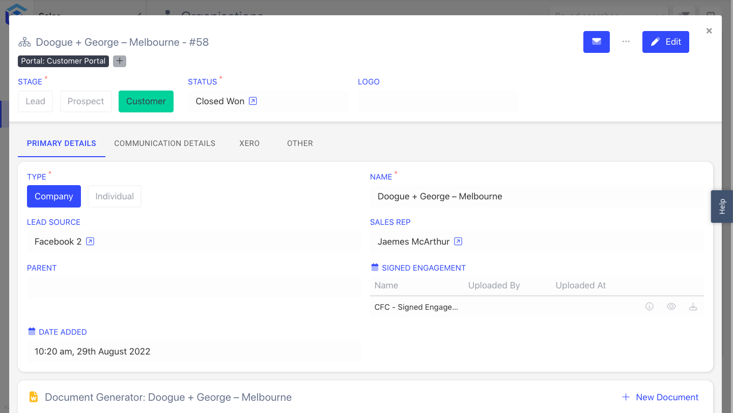
Modals are small, temporary overlay windows that appear on top of the main content. They provide context-specific information or actions without navigating away from the current page. Modals are ideal for displaying additional details and notifications or prompting users for input while keeping the underlying content visible.
1.1. Modal Dimensions
The Entry Layout settings provide options for configuring the dimensions of Modals used within the layout. The Modal width can be customised using predefined size values or specifying a specific pixel value, e.g. 800 means 800 pixels.
To set the modal dimensions, follow these steps:
- Open the Entry Layout where you want to configure the modal dimensions.
- Go to the Settings section of the layout.
- Choose one of the predefined size options or enter a specific pixel value to set the modal's width.
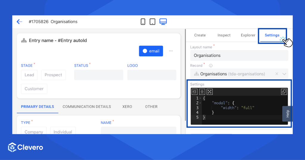
See the examples of each dimension below:
xs = Extra small size
xs = Extra small size{
"modal": {
"width": "xs"
}
}
sm = Small size
sm = Small size{
"modal": {
"width": "sm"
}
}
md = Medium size
md = Medium size{
"modal": {
"width": "md"
}
}
lg = Large size
lg = Large size{
"modal": {
"width": "lg"
}
}
xl = Extra large size
xl = Extra large size{
"modal": {
"width": "xl"
}
}
full = Full-width size
full = Full-width size{
"modal": {
"width": "full"
}
}
2. Full Screen
Full Screen layouts occupy the entire viewport, immersing users in a dedicated interface. They create an immersive experience by removing distractions and focusing the user's attention solely on the content at hand. Full Screen layouts provide ample space for content and interactions, making them suitable for complex tasks and content-heavy interfaces.
3. Comparison
Both Modals and Full Screen views offer advantages and considerations. Understanding the differences between these two options is important for making informed design decisions. Let's explore and compare these two options:
| Modals | Full Screen |
|---|---|
| Small, temporary overlay windows | Occupies the entire viewport |
| Provides context-specific information or actions | Allows for detailed content display |
| Keeps underlying content visible | Removes distractions, focuses the user's attention |
| Limited screen space for content | Offers ample space for content and interactions |
| Ideal for quick interactions and simple tasks | Suitable for complex tasks and content-heavy interfaces |
| Can be used for notifications, form submissions, or confirmations | Great for multimedia, presentations, and visually-rich content |
| Less disruptive to the overall user flow | Requires users to transition to a new interface |
📌 Need Help?