Pie Chart
🥧 Visualise proportions and distributions using slices of a circle.
A Pie Chart is a graphical representation of data that divides a circle into slices to show how individual categories contribute to the whole. Each slice size is based on its value relative to the total dataset.
A Pie Chart widget consists of two main sections:
config: Controls the appearance and layout of the graph.aggregation: Controls how the data is grouped, calculated, and sorted before display.
Complete JSON Example
{
"config": {
"settings": {
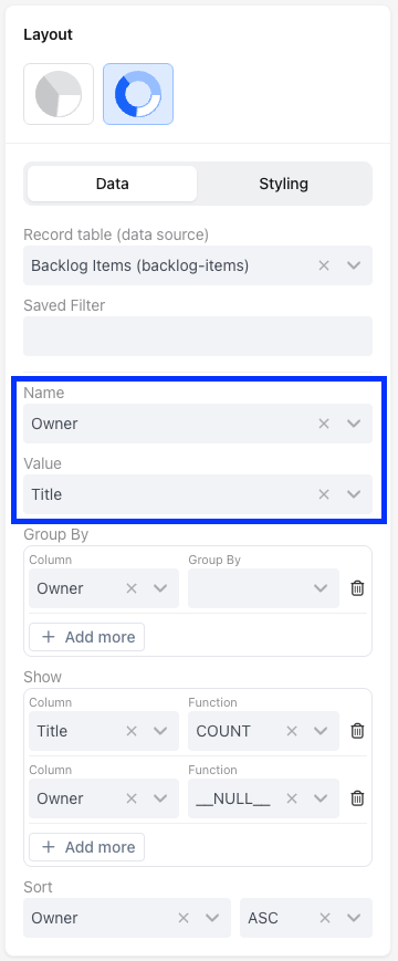
"title": "Clients by Referral Source",
"titleTooltips": "",
"nameAccessor": "owner",
"valueAccessor": "title",
"hideLegends": false,
"showPercentages": true
},
"type": "radial-bar-chart"
},
"aggregation": {
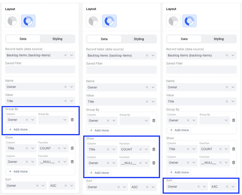
"groupBy": [
{
"column": "owner"
}
],
"functions": [
{
"column": "title",
"fn": "COUNT",
"alias": "title"
},
{
"column": "owner",
"fn": "__NULL__",
"alias": "owner"
}
],
"sort": {
"sortBy": "owner",
"order": "asc"
}
},
"base-record": "233450",
"saved-search": "10026418"
}1. Widget Configuration (config)
config)This section configures the appearance and labelling of the Line Chart.
type: Specifies the chart type.
| Type | Description |
|---|---|
pie-chart | Standard pie chart |
radial-bar-chart | Circular radial bar chart |
settings: Contains the visual settings for the chart.title: Sets the title displayed above the chart.titleTooltips: Adds tooltip text to the chart title.nameAccessor: Specifies which field is used as the slice label.valueAccessor: Specifies which field determines the slice size.hideLegends: Controls visibility of the chart legend.showPercentages: Controls whether percentages are displayed.
JSON Example
"config": {
  "type": "radial-bar-chart",
  "settings": {
    "title": "Clients by Referral Source",
    "titleTooltips": "",
    "nameAccessor": "owner",
    "valueAccessor": "title",
    "hideLegends": false,
    "showPercentages": true
  }
}
2. Widget Aggregation (aggregation)
aggregation)This part defines how data is aggregated for the Line Graph. It specifies the columns to group by, functions to apply, and sorting order.
groupBy: Indicates that the specified column should group data within a specified date format.functions: Specifies functions to be applied to columns.
Function (fn) | What it does |
|---|---|
SUM | Adds all the numbers together |
COUNT | Counts how many entries are there |
AVG | Calculates the middle value |
MIN | Finds the smallest number |
MAX | Finds the largest number |
DATE_FORMAT | Groups messy dates into clean "Months" or "Weeks." |
__NULL__ | Just grabs the name/text without doing any math. |
sort: Specifies sorting based on the specified column in ascending order.
JSON Example
"aggregation": {
  "groupBy": [
    {
      "column": "owner",
      "accessor": "owner"
    }
  ],
  "functions": [
    {
      "column": "title",
      "fn": "COUNT",
      "alias": "title"
    },
    {
      "column": "owner",
      "fn": "__NULL__",
      "alias": "owner"
    }
  ],
  "sort": {
    "sortBy": "owner",
    "order": "asc"
  }
}
📌 Need Help?