
👤 Customize your header field.
1. Overview
The header tile is a mandatory object that must be placed inside the header field. The Header tile shows the edit/save button, the page title, workflow buttons, and the ability to show form data (fields).
2. Object Properties
The table provides a summary of the object properties associated with the header special type item, including their types, mandatory or optional status, and descriptions.
| Object Properties | Type | Requirement | Description |
|---|---|---|---|
type | string | Mandatory | Always set to form-section. |
title | object | Optional | The title is displayed at the top of this section. Contains elements and configuration of the header. |
content | array | Optional | Contains an array of fields to be included in header special tile type. |
button | array | Optional | Contains an array of fields that configure the buttons on all pages. |
2.1. Breakdown of Object Properties
title
title here contains elements, global helpers, and icons used for the title. The table provides an insight into the various object properties of the title:
| Field | Type | Mandatory/Optional | Description |
|---|---|---|---|
elements | array | Optional | Access any field from the current entry in the title. |
joinWith | string | Optional | Join all the elements present in the title. |
icon | boolean | Optional | If set to true, use the record’s icon. If set to false, the icon won’t show. |
iconColor | string | Optional | Change the icon colour. |
button
The button property affects all pages (assuming the current user has all permissions). There are two types of buttons that can be added:
copydelete
Optional buttons (only present if configured):
export-to-json
Additionally, if set up via Record settings, these buttons will automatically show:
emaildocs-generator
Note:The above values are what we use as key in the
buttonsMenu,buttonsLeftandbuttonsRightoptions.
Configuring Buttons
We have many options to change where a button renders and what the button looks like. To modify a button inside the menu, use the buttonsMenu option:
{
   "type": "header",
   "buttonsMenu": [
       {
         "key": "copy",
         "label": "Copy this entry",
         "icon": "fad fa-pie"
       }
   ],
   ...
}
To change the location of a button (move it from the menu to outside the menu so it always shows on the page), we must first understand the layout of the Header.
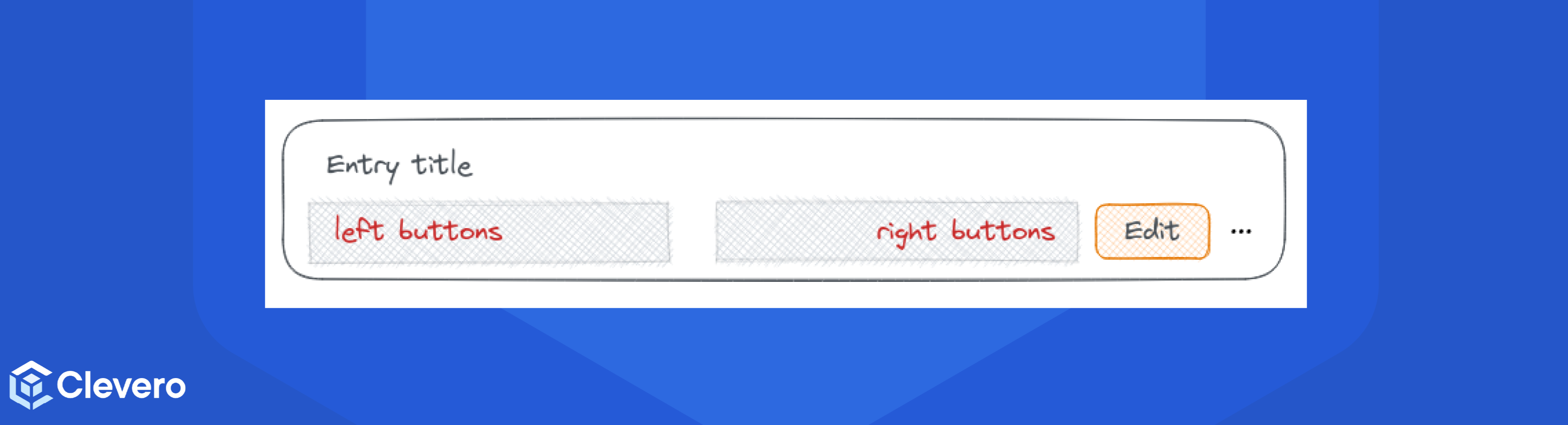
For example, to place buttons into the “left buttons” or “right buttons”, use the following configuration:
{
   "type": "header",
   "buttonsLeft": [
       {
         "key": "Button trigger A",
         "label": "Button A",
         "color": "primary",
         "icon": "fad fa-acorn"
       },
       {
         "key": "email"
       }
   ],
   "buttonsRight": [
       {
         "key": "copy",
         "color": "secondary"
       }
   ],
   ...
}
Note:For color, we can use
primaryorsecondaryto match the theme colors, or pass a hex code like#CC66FF.
content
The content of a Header can be used to display some input fields in the same way as the form-data tile can. To configure the content of a Header tile, please see the documentation for the form-data content type.
Note:Only items that can go inside the Header are items of type
field, and items of typefield-group.
3. Sample Configuration
- Here is a minimum sample configuration of the
header:
{
   "type": "header",
   "title": {
     "elements": [
     "{{singular record.name}}"
     ],
     "icon": true
   },
   "content": []
}- Here is a full title configuration of the
header:
{
   "type": "header",
   "title": {
     "elements": [
     "{{singular record.name}}",
     "#{{entry.autoId}}",
     "ID {{entry.id}}",
     "{{{entry.name}}}",
     "{{entry.customer}}",
     "Priority {{entry.priority}}"
     ],
     "joinWith": " - ",
     "icon": true,
     "iconColor": "primary"
   },
   ...
}
📌 Need Help?